WEBSITE DESIGN – UX, UI
Edwards Lifesciences redesign
Understanding the brief
We held a scoping workshop with the client’s team to understand the business objectives for the new careers website:
- Implementing the new TVP messaging and branding via the new careers website
- Raising awareness of Edwards’ positive impact in the community
- Communicating the innovative nature of Edwards’ work
- Applying user-centered approach to structure and presentation of content
- Streamlining the application process
- Improving the navigation
- Aspirational design
.gif)
Building the new information architecture
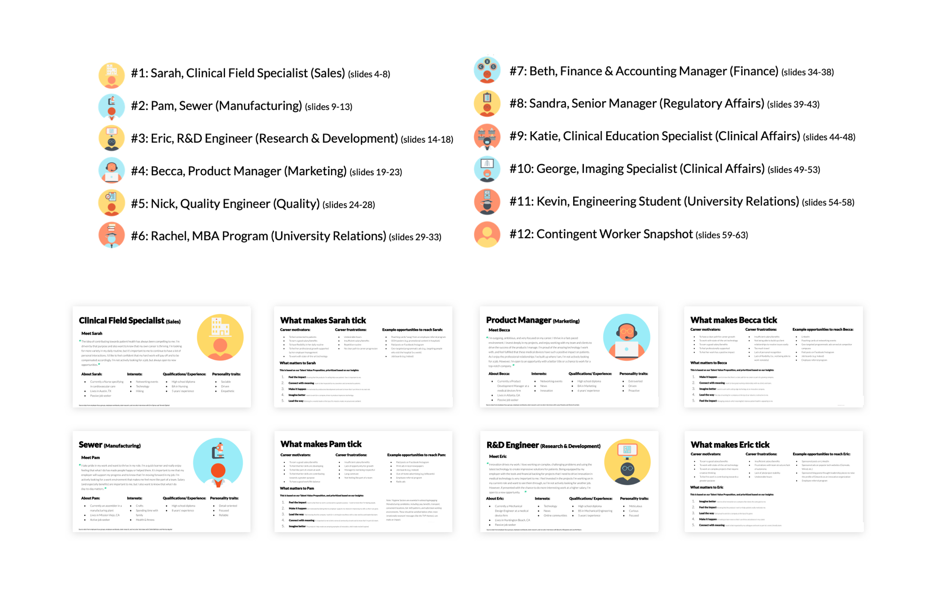
We held a series of internal workshops to interrogate the personas and identify key content categories. This gave us a clearer picture of our users needs and obstacles, as well as expectations.
We then conducted a card sorting exercise to plan the new information architecture for the Edwards careers website. Once the structure of our new website was set, we created a first draft sitemap for the new Edwards careers website and verified it using the personas-based user journeys.
We then conducted a card sorting exercise to plan the new information architecture for the Edwards careers website. Once the structure of our new website was set, we created a first draft sitemap for the new Edwards careers website and verified it using the personas-based user journeys.
Wireframing
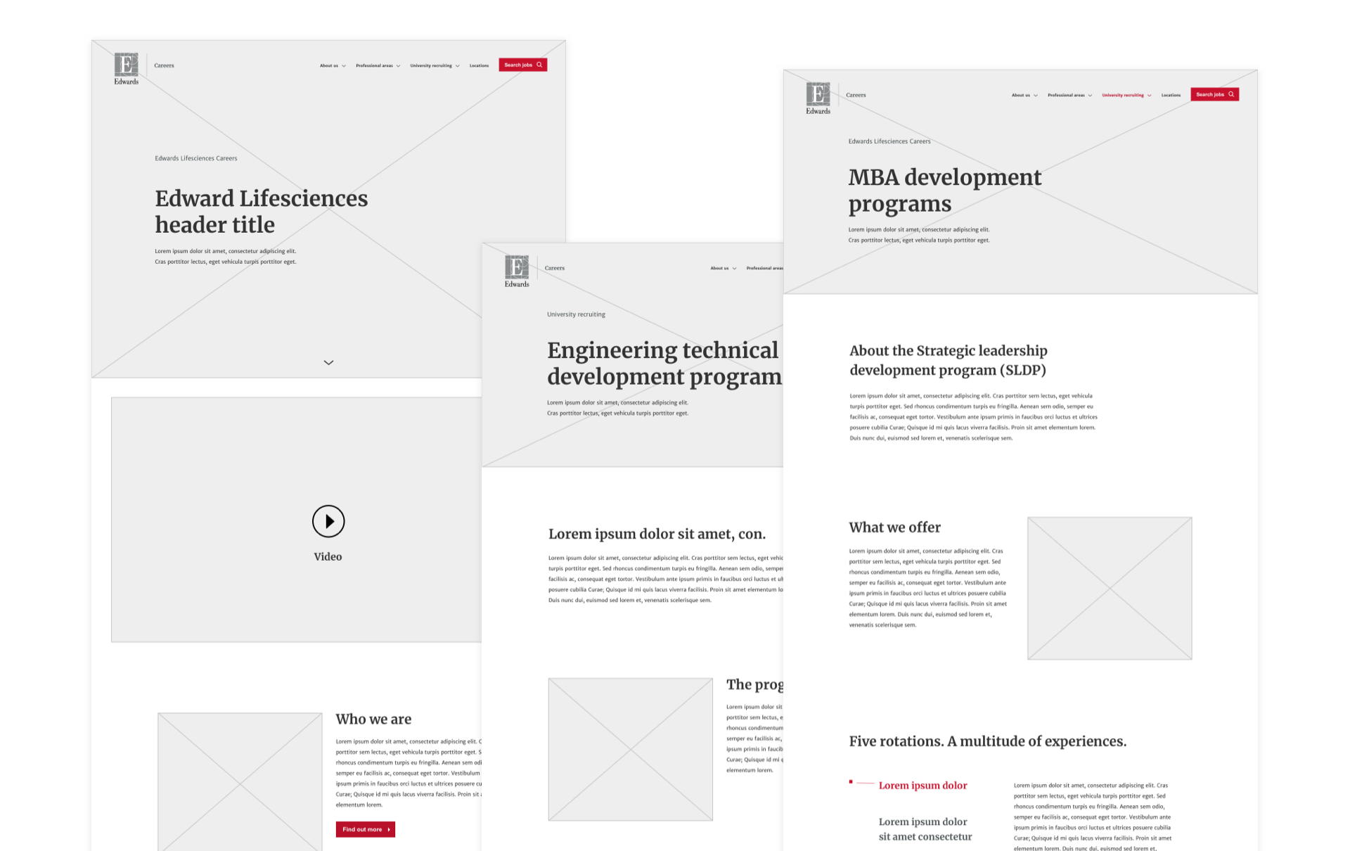
Starting off the insights gathered on the discovery phase, we produced a first version of wireframes that we would later on keep refining with feedback from the client and user testing. We followed a collaborative, iterative approach that continued through to the interaction design specifics during the upcoming design phase of the project.
User testing
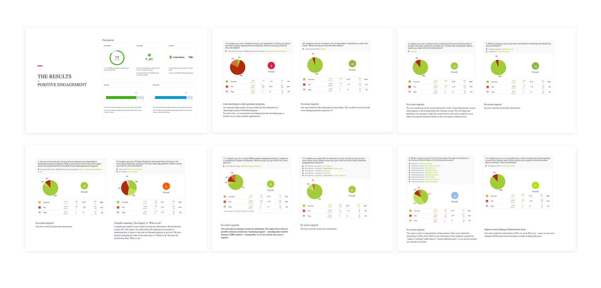
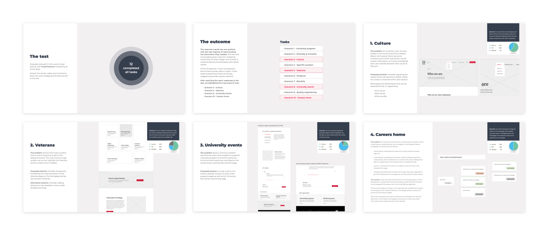
16 people took part in this round of user testing, with 12 participants completing all of the tasks.
Overall, the results, videos and comments show the users engaging and reacting well to the site. The response was very positive, with the vast majority of users locating the information they needed. This was very encouraging given users are navigating wireframes. Of the 10 tasks set, 7 were completed to benchmark success rates or higher. Three tasks showed lower levels of success, suggesting amends may be required.
Overall, the results, videos and comments show the users engaging and reacting well to the site. The response was very positive, with the vast majority of users locating the information they needed. This was very encouraging given users are navigating wireframes. Of the 10 tasks set, 7 were completed to benchmark success rates or higher. Three tasks showed lower levels of success, suggesting amends may be required.
Design
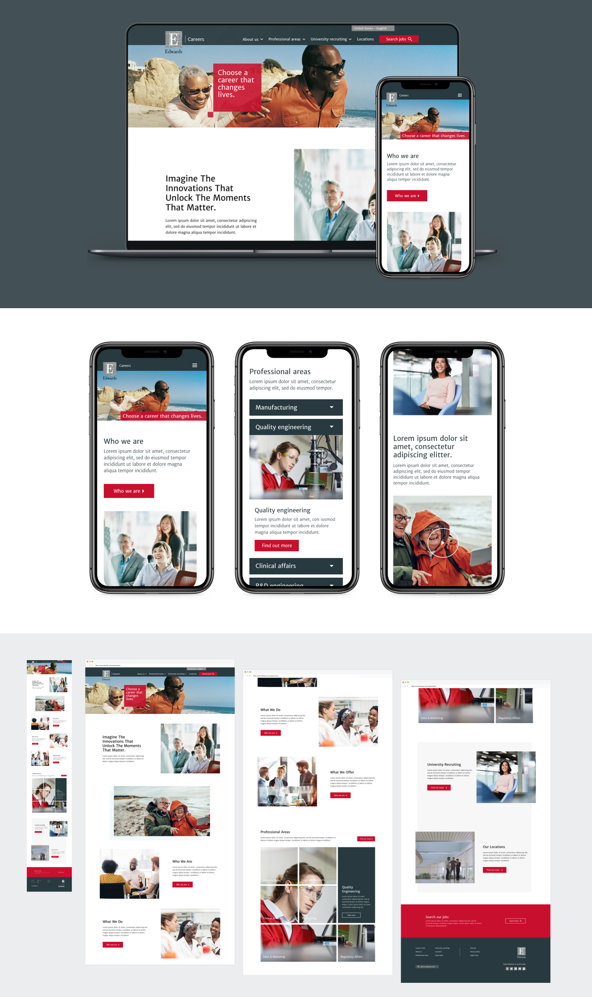
We wanted the site to feel vibrant and full of energy, but with a contemporary feel. To create a point of difference between the corporate and careers site, we introduced the slate grey as one of our primaries, taking over areas such as the navigation and footer areas. We kept uncluttered layouts to improve readability and maximise the impact of the CTA elements.
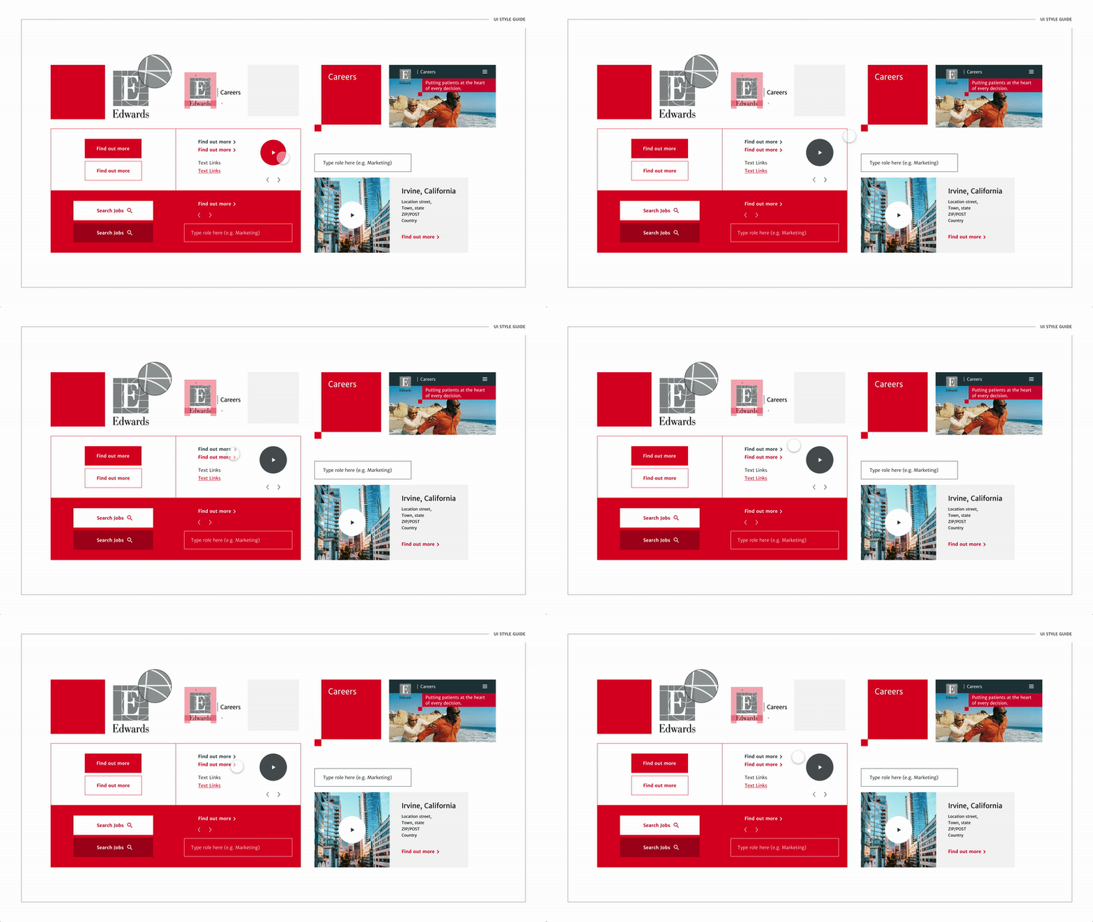
Our style guide included a range of micro-interactions that aimed to reinforce the brand's personality and created a consistent experience throughout.

Our style guide included a range of micro-interactions that aimed to reinforce the brand's personality and created a consistent experience throughout.
Role Lead Digital Designer
Responsibilities end-to-end website design (discovery, IA and sitemap, wireframing, design and prototyping)
Launch date 2021
Responsibilities end-to-end website design (discovery, IA and sitemap, wireframing, design and prototyping)
Launch date 2021